Web applications
Tasks studies - laboratory
Project maintained by dawidolko Hosted on GitHub Pages — Theme by dawidolko
Web Applications 1 (AI1) – Lab No. 1
Bootstrap v5.3
Start of the lab:
• download and run the script Installing VSCode.bat extensions,
• download the Lab001_AI1_start.zip archive to your desktop, which contains the files needed to perform the tasks, and unpack this archive,
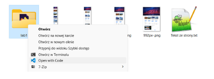
• go to the unpacked folder and open the lab1 folder in VSCode,
Tasks (Bootstrap):
Task 1.1:
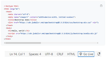
In VSCode, go to the index.html file, into which paste the “Starter template”. Display the page via the “Live Server” by clicking Go Live (on the bottom bar). link
Task 1.2:
The Starter template contains <link href=… and <script src=… tags with
CDN (Content Delivery Network) addresses that deliver the necessary Bootstrap components (code).
Change them to use local files already placed in the css and js folders.
<link href="css/bootstrap.css" rel="stylesheet" />
...
<script src="js/bootstrap.bundle.js"></script>
Task 1.3:
Based on the image below (presenting the entire website), recognize individual Bootstrap components and use them to create an identically looking page - supplement the index.html file:
• the title of the page is “Mountain trips”,
• clicking the link in the navbar takes you to the given section, other links/buttons do not take action,
• Start section: for the scrolling gallery (carousel) use images: carousel1.jpg -
carousel3.jpg, captions in the carousel: “Amazing experiences!”, “Amazing views!”,
“The beauty of nature!”,
• Trips section: use the remaining images for the cards,
• Price list section: striped table, darkening the row after hovering the cursor,
• Other section: video address to embed: link (16x9 proportions),
• Other section: form *, types of offer to choose from: individual/group/special.
link
link
link
link
link
link
link
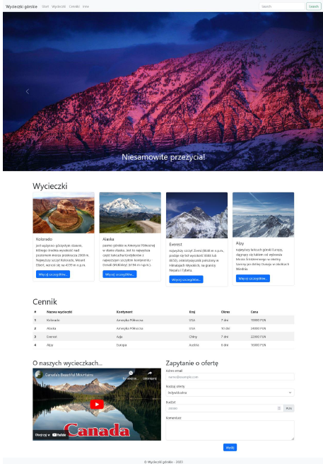
You should not use your own CSS styles at all! (e.g. width 25% etc.)
<div class="ratio ratio-16x9">
<iframe src="https://www.youtube.com/embed/t7ZpJ7wWlZI"></iframe>
</div>
<footer class="container-fluid bg-body-tertiary">
<div class="row text-center pt-2">
<p>© Mountain trips – 2024</p>
</div>
</footer>
Task 1.4:
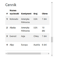
Based on the files:
• 0-576px.png,
• 576-768px.png,
• 768-992px.png,
• 992px-.png,
recognize how the arrangement of selected page elements was determined for the given screen widths and supplement the index.html file in the appropriate places with classes using “breakpoints” to add responsive page behavior (in the form as in the previously mentioned files).
In addition, set it so that the table can be scrolled horizontally when its content does not
fit on the screen. link
link
Task 1.5: *
Apply “dark mode” to the entire page.
Set the carousel caption text to white permanently.
link
link
-
– tasks/sub-items to complete/do on your own,
-
– tasks/sub-items for those interested.
Information for task 1.4: for example, if in Windows on a laptop with a Full HD screen, e.g. scaling x1.25 is set, then the “breakpoints” will behave taking into account this multiplier.
After completing the lab, delete all downloaded and created files from the computer in the lab.
File version: v1.0